Introduction
edfinr includes capital, debt, and fund-balance
variables to provide more inforation on school facilities funding.
The skinny dataset includes total capital outlay in dollars and
per-pupil terms (exp_cap_total,
exp_cap_total_pp). The full dataset adds
the detailed components and the debt/fund-balance picture:
-
Capital outlay components:
exp_cap_construction,exp_cap_land,exp_cap_equip_instr,exp_cap_equip_other,exp_cap_equip_nonspec. -
Debt service:
exp_debt_interest(interest only). -
Debt stocks:
debt_lt_begin,debt_lt_issued,debt_lt_retired,debt_lt_end,debt_st_begin,debt_st_end. -
Fund balances (fiscal year end):
fund_bal_debt_svc,fund_bal_bond,fund_bal_other.
Use list_variables("full", category = "debt") to see the
debt and fund-balance entries, and
list_variables("full", category = "expenditure") for the
capital outlay items.
Important caveats
Read these before ranking or comparing districts on capital spending.
-
Capital is not current spending. Capital outlay is
excluded from
exp_cur_totalby definition. Do not add it to current spending to get a “total” without knowing what you are combining. -
Capital spending is lumpy. A district that builds a
school records a large
exp_cap_total_ppin one year and near-zero in the surrounding years. Single-year per-pupil capital rankings are misleading; 3-5 year averages can provide a more accurate picture. -
Compare per-pupil, not totals. Raw dollar rankings
mostly rank district size. Only
exp_cap_total_ppships as a per-pupil column; divide the debt and fund-balance variables byenrollyourself, as the examples below do. -
Bond-funded vs. pay-as-you-go. High capital outlay
may be financed by borrowing rather than current resources. Read
debt_lt_issuedandfund_bal_bondalongside the outlay flows to understand how construction was paid for. -
Interplay with the state-revenue adjustment. edfinr
nets state capital and debt aid out of
rev_state; that netted-out amount ships asrev_state_cap_debt, the pre-adjustment value is preserved inrev_state_unadj/rev_state_unadj_pp, andc11_spike_flagflags district-years where that adjustment spikes. Consider these when relating revenue to capital activity. -
Stocks stay nominal. Debt and fund-balance
stocks (
debt_*,fund_bal_*) are balance-sheet levels and are never CPI-adjusted when you passcpi_adj. Capital outlay flows andexp_debt_interestare adjusted.
Worked example: multi-year average capital per pupil
Because capital expenditures are lumpy, averaging over several years can produce more interperatable results. The example below examined Ohio school distircts, using CPI-adjusted 2023 dollars, to average per-pupil capital outlay over the five most recent years. Only districts with at least three years of data and at least 1,000 students are included, since very small districts can produce extreme per-pupil values from modest capital projects.
oh <- get_finance_data(
  yr = "2012:2023", geo = "OH",
  dataset_type = "full", cpi_adj = "2023"
)

cap_multiyear <- oh |>
  filter(year >= 2019) |>
  group_by(ncesid) |>
  summarize(
    dist_name = dist_name[which.max(year)],
    n_years = sum(!is.na(exp_cap_total_pp)),
    avg_cap_pp = mean(exp_cap_total_pp, na.rm = TRUE),
    avg_enroll = mean(enroll, na.rm = TRUE),
    .groups = "drop"
  ) |>
  filter(n_years >= 3, avg_enroll >= 1000) |>
  arrange(desc(avg_cap_pp))

head(cap_multiyear, 10)
## # A tibble: 10 × 5
## ncesid dist_name n_years avg_cap_pp avg_enroll
## <chr> <chr> <int> <dbl> <dbl>
## 1 3904500 Warrensville Heights City 5 13083. 1711.
## 2 3904560 Rossford Exempted Village 5 12939. 1613.
## 3 3904407 Grandview Heights Schools 5 11914. 1106
## 4 3904524 Harrison Hills City 5 11392. 1452
## 5 3904672 Northeastern Local 5 10930. 1039
## 6 3904716 Berkshire Local 5 10003. 1347.
## 7 3904493 Upper Arlington City 5 9994. 6221
## 8 3904652 Wynford Local 5 8449. 1159.
## 9 3910018 Warren Local 5 8400. 2002.
## 10 3904780 Indian Creek Local 5 8271. 1978.How lumpy is capital spending?
Plotting the full 2012-2023 series for Ohio districts with the highest recent averages shows why single-year rankings mislead: a district’s per-pupil capital outlay can swing by thousands of dollars from one year to the next as projects start and finish.
oh |>
  select(-dist_name) |>
  inner_join(
    head(cap_multiyear, 6) |> select(ncesid, dist_name),
    by = "ncesid"
  ) |>
  ggplot(aes(x = year, y = exp_cap_total_pp)) +
  geom_line() +
  geom_point(size = 1) +
  facet_wrap(~dist_name, ncol = 2) +
  scale_x_continuous(breaks = seq(2013, 2023, 4)) +
  scale_y_continuous(labels = scales::label_dollar()) +
  labs(
    title = "Per-Pupil Capital Outlay Is Lumpy",
    subtitle = "Ohio districts with the highest 2019-2023 average, in 2023 dollars",
    x = "Year",
    y = "Capital Outlay Per-Pupil"
  ) +
  theme_minimal()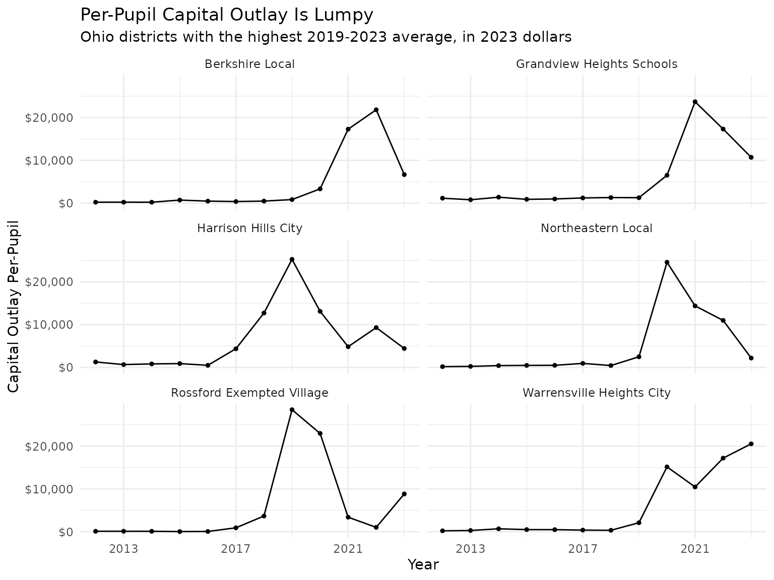
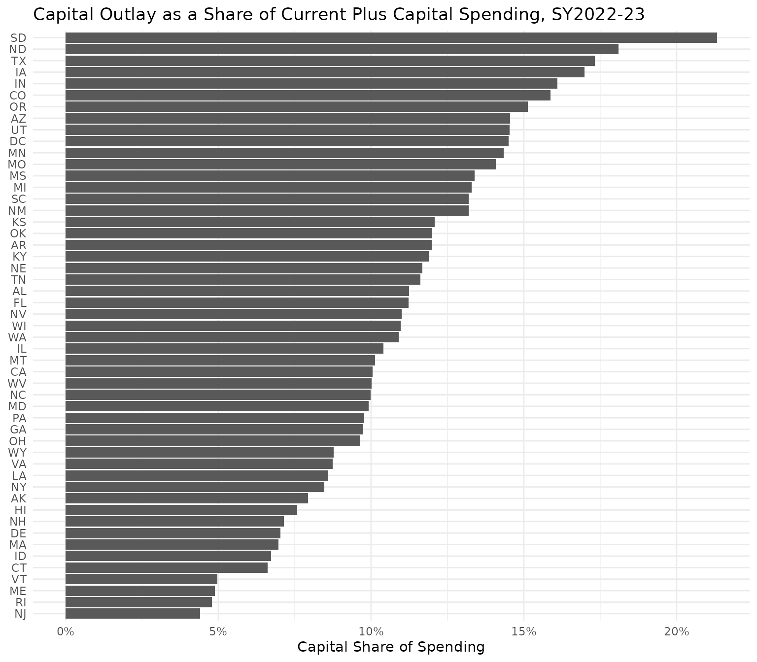
How does capital’s share of spending vary by state?
Statewide aggregates smooth out district-level lumpiness and show how much of each state’s total K-12 spending goes to facilities. Shares are computed only from districts reporting both current and capital expenditure. Smoothing is not a cure-all: a state’s single-year share still moves with bond program cycles and could be affected by a single large district’s projects. Treat the ranking below as a snapshot; pool several years of data before drawing conclusions about a state’s ranking.
us_2023 <- get_finance_data(yr = "2023", geo = "all", dataset_type = "full")

state_cap <- us_2023 |>
  filter(!is.na(exp_cap_total), !is.na(exp_cur_total)) |>
  group_by(state) |>
  summarize(
    cap_share = sum(exp_cap_total) / (sum(exp_cur_total) + sum(exp_cap_total)),
    .groups = "drop"
  )

ggplot(state_cap, aes(x = cap_share, y = reorder(state, cap_share))) +
  geom_col() +
  scale_x_continuous(labels = scales::label_percent(accuracy = 1)) +
  labs(
    title = "Capital Outlay as a Share of Current Plus Capital Spending, SY2022-23",
    x = "Capital Share of Spending",
    y = NULL
  ) +
  theme_minimal()